Notice Anything Different About DealNews Today?

Notice anything different about DealNews? (It's OK. You can tell us we look wider.)
That's because today, we released a new layout that's wider and more responsive to your screen, so you can power up your deal-browsing experience.
So what changed?
There Are 25% More Deals on Some Pages
On pages like our Editors' Choice hub, you'll see even more deals than before.
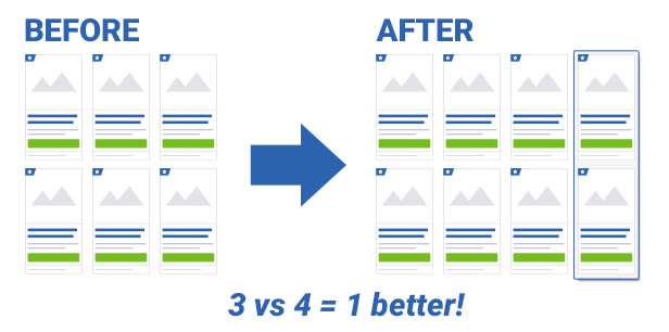
If you have a wide enough browser window, the page will display four columns of content instead of three. And four is definitely better than three when it comes to efficient deal perusal.
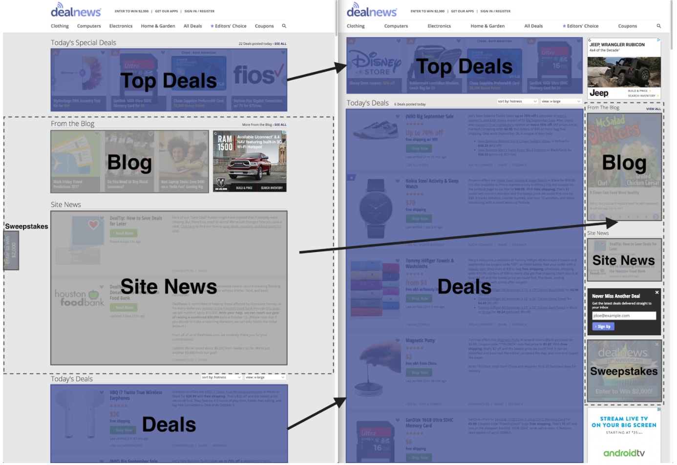
We Added a Right Sidebar for Important News and Such
In the new layout, our deals are front and center, while supplementary content — like blog articles, sweepstakes announcements, and site news — are now in the right sidebar. Now, it'll be easier to locate our shopping guides, consumer news, and site announcements in the same place every time.
Can't wrap your head around it? Check out this helpful diagram to see the before and after:
Deal Images Can Get LARGER
We also bumped up the image sizes so you can peep those deals better.
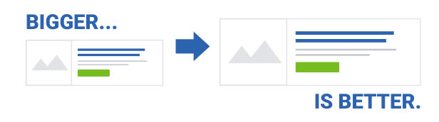
On the home page, the deals will grow in size as you make your browser window bigger, giving you a closer look at our top finds before clicking through to the store.
Tell Us What You Think!
We released a preview of this layout in December of last year, and we made some changes to the design based on your feedback. But you can still weigh in on how we can improve it further by leaving a comment below!
So DealNews readers, what do you think of the change? What else could we do to improve the site?
using your service for years and am very sad to see you convert to pitiful new format
Classic was the best ever!
I will miss you.
Please have the option to go back to the Classic layout.
I understand you have record hits from across North America each time receiving a kickback {MONEY}. No one that I work with, no one I socialize with, no one that I have sex with likes the "new" layout.Is it time to go somewhere else??
Hat Hate Hate the new layout
Apr 7, 2021, 3:21 PM EDT
Hello Larry,
Thank you for your feedback. I have forwarded your message to our team for consideration.
We'd love to keep classic around to please everyone, but don't have the resources to maintain it. We are currently in the process of testing improvements to the beta site that will allow us to migrate the last remaining traffic to the new layout. Hopefully these improvements will address your concerns with the new layout.
Cheers,
Sandy | DealNews
Lawrence Frost
Mar 31, 2021, 5:20 PM EDT
> hi
>
other than the look I liked in classic, I miss sorting by category. It's too broad. Home and garden with 300+ deals and load next 20. I liked how it was arranged before. Computer, ipad, electronics, etc. at least if you had it organized it like that it would be better. That's why I went to classic view. I just wanted the items listed not show next 20.
'thank you
Larry frost
Mar 30, 2021, 3:11 PM EDT
Hello Lawrence,
Thanks for contacting us.
We are working to sunset our Classic layout and transition to Beta only. The Classic site is no longer supported and not under active development, so bugs and new features will not be addressed in it. Are there certain features from our Classic layout that you are missing with our Beta layout?
Cheers,
Sandy | DealNews
Lawrence Frost
Mar 28, 2021, 10:05 PM EDT
I hate this. Every time dealnews opened like this id select back to classic. I don't know if I'll be using dealnews anymore. I dealt with the loss of dealmac. I've been coming to the site for 17 years I believe since the launch of Jaguar. I am so livid. I know need to deal with change but I don't know if I will stick around for this.
Support: support@dealnews.zendesk.com
The image boxes slowly get longer and longer until they take over the screen.
The images disappear when you do figure out how to expand a given entry such that it shows details on an entry that you forgot what you were even looking for.
Thank goodness that edster below mentioned Classic Mode. My buttons were all hidden but I figured out how to go back which is a huge help.
I realize you want to be fancy and progressive and all, but functionality and speed are pretty important. The new site simply sacrifices too much in order to obtain...well... whatever you were trying to accomplish. I agree that it should be reverted back or continue working on it.
See bigger pics with less information.
I may not shop as much. Took the fun out of it. Whoever said change was good?
Really dropped the ball here and it will hurt you financially
From scanning the comments bellow -- it seems that almost 100% of the posters dislike the new look.
To everyone else, we appreciate the feedback. We went through a small, focused release and received a mixed response and worked to address the concerns. We continue to request feedback and are including active Dealnews users in interactive feedback sessions, so look at for those opportunities.
You know, there are enough copycat sites that we don't have to go to extremes to buy these deals from here... I have LOVED this site but the changes may finally make me look elsewhere.
"Listen to me, how come you never listen to me
Ooh and it seems there's no way out
I've been trying but we cannot connect
And there's no reply at all
There's no reply at all
There's no reply at all
no reply at all
Is anybody listening? Ooh
There's no reply at all
Is anybody listening? Ooh
There's no reply at all"
After 32 comments it's really sad, enough said.
I've read through all the comments, and so far, I haven't seen a single positive remark. That should tell you something.
In case it helps anyone else, I've found that if you're reading this site in a serious way, the most efficient view is to sort by category, with medium-size pictures. That's probably the antithesis of what the designers want you to do. I wish I could make them understand that content is more important than design. And it's far, far more important than this dumb new design.
First you have basically introduced an "ads section".
Worst - it's used for "one screen length" worth of content, and the rest of the time it just keeps 25% of the right side of the screen "taken" by an ugly box which now makes the deals non-symmetrical.
I really prefer it the other way - it was much easier to read the site before. Now, everything is shifted over. :-(